How to use simulation as a network optimization tool
Data scientist
Data scientist
Data scientist
Imagine watching a live football match in a crowded stadium which causes an expected surge in network traffic. This surge is usually handled by adding a base station. Thanks to advancements in simulators to support multi-user and multi cell coverage as, it can now be used to replicate certain aspects of a real networks. In this blog post we reveal how a radio network simulator can be used to simulate these scenarios and decide on an ideal location for base station placement.
Data overview
For our analysis, we used PM data. PM stands for Performance Management. It comprises of several KPI (Key performance indicator) results. A KPI is an end-user perception of a network on a macro layer. KPI statistics are typically used to benchmark networks against each other and to detect problem areas.
We extracted the latitude and longitude of base stations/cells from PM data and used this for base station deployment in a simulator.
Simulator automation pipeline
Simulating a real network environment demands multiple code changes and multiple human touches. To make things easier for future use, we automated the entire simulation.
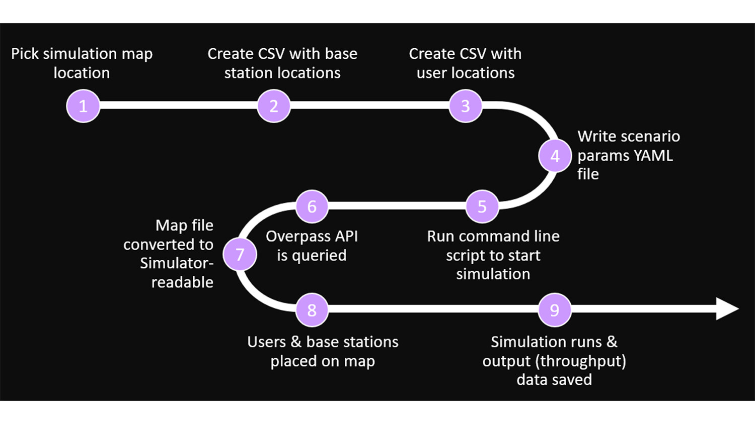
Figure 1: How we automated the simulation.
Picking a simulation map
We used the Overpass Turbo website to create a real map. Overpass Turbo is a web-based data mining tool for OpenStreetMap that uses Overpass API. Using the Overpass API, you can select the map or your physical boundary and query for all the objects you want in the physical boundary.
The image below is an example of a query – a building and a highway. We can see that all the buildings and highways are highlighted. This map is exported as a KML file to our simulator. OpenStreetMap provides us with accurate dimensions of all the buildings including the height/number of floors in each building. This kind of detailing is very important for us so that the simulated environment is as close to a real environment.
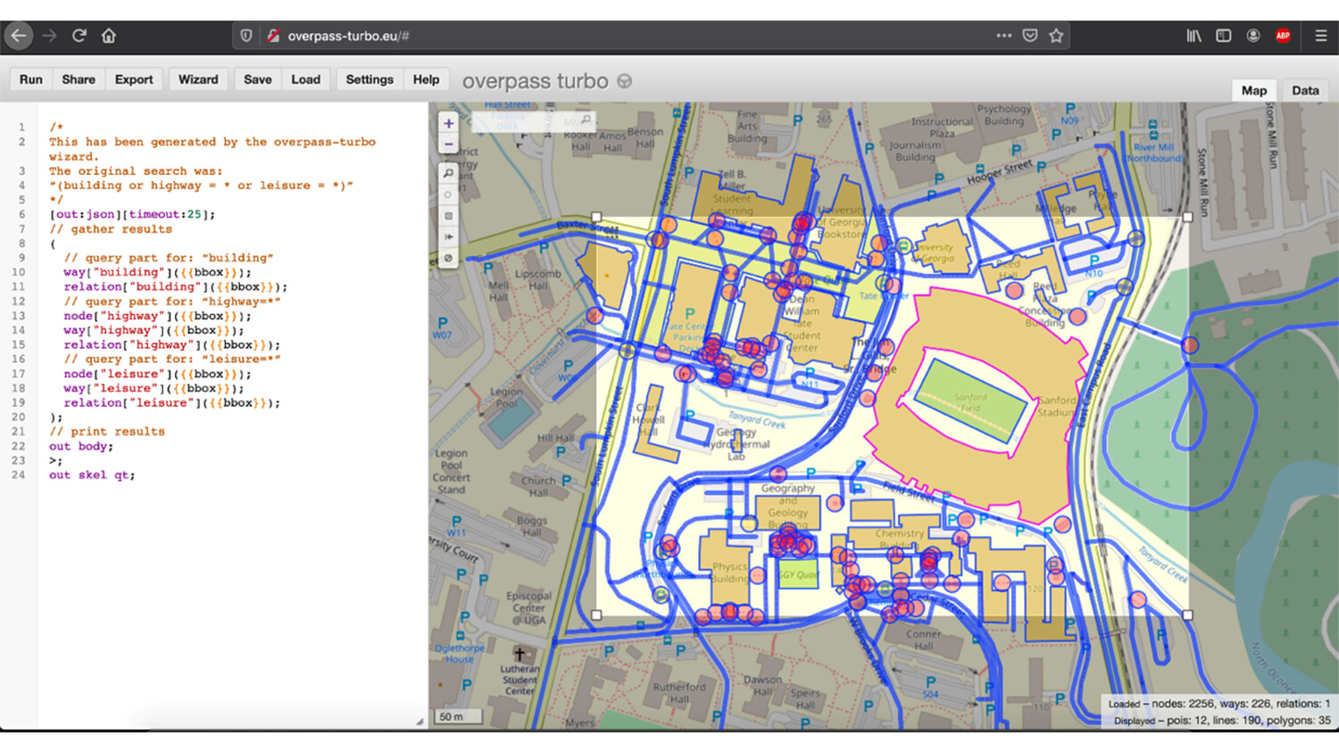
Figure 2: Picking a simulation map via Overpass Turbo
Our automation pipeline supports two options:
- Maps uploaded by the user.
- Automated map creation based on latitude and longitude provided by the user. In other words, based on user provided latitude, longitude and based on user provided size of physical boundary, we can automatically query Overpass Turbo and generate the map.
Deploying base stations and user locations
For the base station deployment, we extracted the latitude and longitude of the base stations from PM data and exported them as a CSV file. This CSV file acts as an input to our simulator and the base stations are deployed directly on the physical environment, created via Overpass Turbo based on the latitude and longitude.

Read more about network optimization
Read our report on network optimization through analytics.
NOTE: All the base stations are identical. At present we do not change the internal properties of base stations. For user location deployment, we randomly deployed users sampled based on building heights. We extract the height of the building via Overpass Turbo and sample the number of users based on height. Then we randomly deploy the users.
Generating user traffic and hot zones
We created a map and deployed users and the base station. Now we move to traffic. For this case study, we needed to increase traffic drastically in specific regions compared to other regions. We did this by creating boundaries in and around a stadium and increasing the traffic within the boundary, while keeping the surrounding traffic at usual traffic levels.
Parameters in YAML file
The map creation above, along with user and base station deployment, and traffic configurations can be provided as input via a YAML file to our simulator.
For base station deployment we provide the base station latitude and longitude as a csv file. Maps can be created on the fly or user can provide an existing map using YAML file.
Traffic was controlled by the boundary conditions and traffic intensity parameters to specify either an increase or decrease in the traffic.
That’s it! Once you have provided values for all the parameters, we just have to run it. Based on the provided parameters, it creates the physical environment, deploys users and base stations, assigns traffic, calculates user throughput and the results are saved in the path provided.
Reports
To generate improved, visually appealing plots, we loaded the output from the simulator into Tableau dashboard.
Figure 3 below is from a stadium. The image on the left is during a normal day’s traffic and the image on the right shows a simulated surge in traffic at the stadium. The circles in the image represent users, and the blue triangles represent base stations. The color of the circles varies from green to orange; green implies users have good throughput and orange implies low throughput.
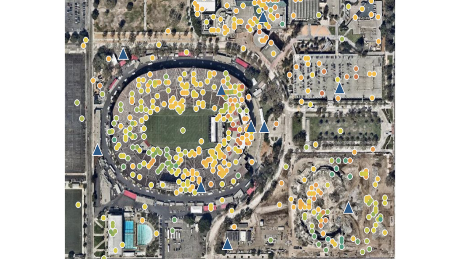
A tableau dashboard of our physical environment
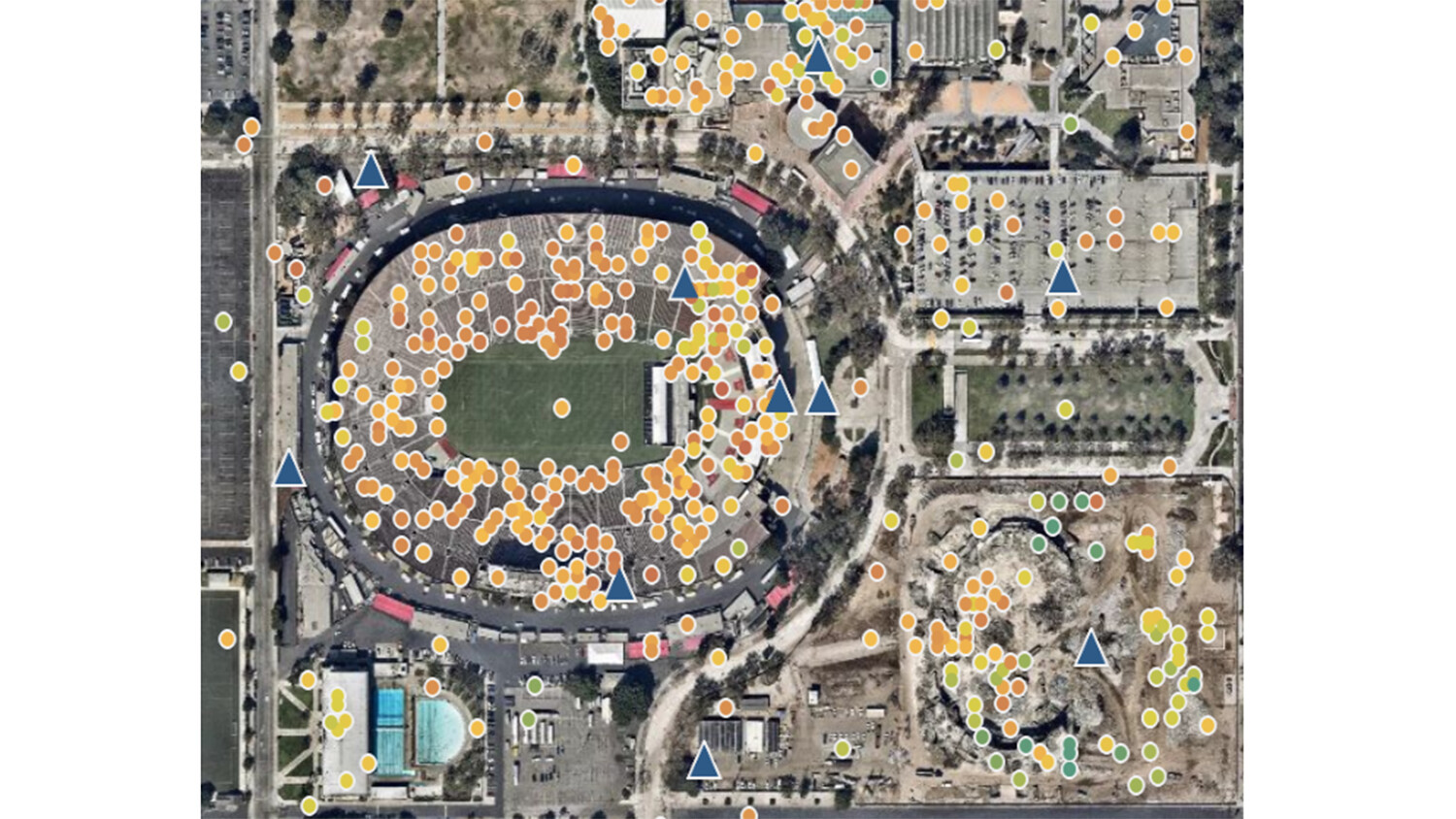
We inferred that during a surge in traffic there was a huge degradation in throughput for several users, as seen in the image on the right of figure 3. To address this, we added a new base station and used the combination of a tableau dashboard and a user throughput distribution plot to determine the ideal location.
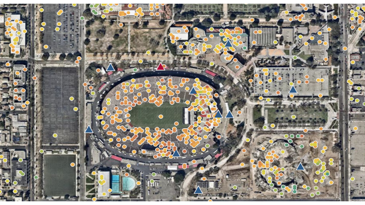
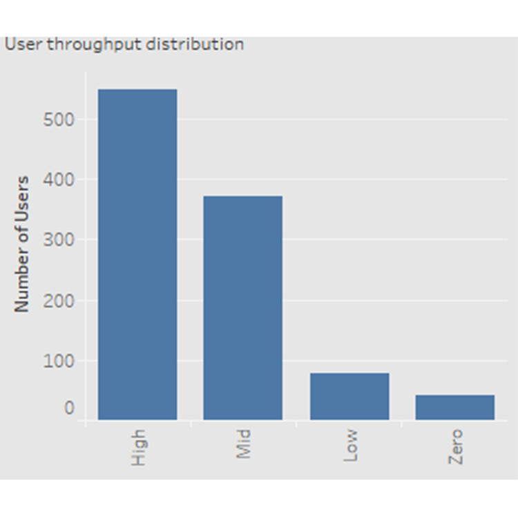
Figure 4: A tableau dashboard of our physical environment with a new base station
Note: Adding a base station close to the surge/stadium does not guarantee optimal coverage solution. But in our case, it did.
Acknowledgements
This work is a result of contributions from the following team members within Ericsson: Anila Joshi, Hasan Farooq, Kunlun Liu, Ravi Pandya, Thalanayar Muthukumar.
Learn more
Read more about network optimization.
Read our article, A better network with big data.
Read our blog post about Network design and optimization software across Europe and Latin America.