As the new Advertising Manager of Telefonaktiebolaget L M Ericsson, I requested an allocation in my first budget in 1972 to start a Corporate Visual Identity project (CVI). My request was denied that year, and in subsequent years.
My motivation was that a company of this size and significance needed a program for its visual communications.
Finally, in June 1979, I was assigned by management to implement the project. It would have to be completed in 19 months, however, compared with my estimated time requirement of 36 months. No guidelines were handed down at the time, or directions – and no reasons.
The extremely short amount of time allocated for the project placed special demands and restrictions on excessive costs.
A project group was formed in the autumn of 1979 consisting of representatives from the corporate information, legal, standards and marketing staffs, the advertising department and Allied Designers Ltd. (AID), a consultant company based in London.
After visiting several subsidiaries in Sweden and abroad, AID presented a fundamental report in which it proved unequivocally that there was a strong need for a common approach to the graphic profile. The report also stated that some subsidiaries – due to the lack of guidance from corporate management – had already started similar projects of their own.
In 1980, the project group was informed of management's motivation for the project: among other considerations, Ericsson planned to acquire Datasaab and incorporate the company in the private market. This had not been a priority area in the past, and a new graphic profile was needed, therefore, to deal with completely new customers and competitors. Management also declared that Ericsson's new graphic profile would be introduced in all parts of the world on January 2, 1982.
Early in the autumn of 1980, the project group studied AID's detailed proposals for The Visual Link, which later became known as the logotype, and a large number of related applications. Eventually, four proposals remained.
The project group was then asked to conduct a sealed vote to select which proposal would be adopted and announced later that same day by Björn Svedberg, President of Ericsson. The project group was unanimous in its choice of one proposal, and President accepted its recommendation.
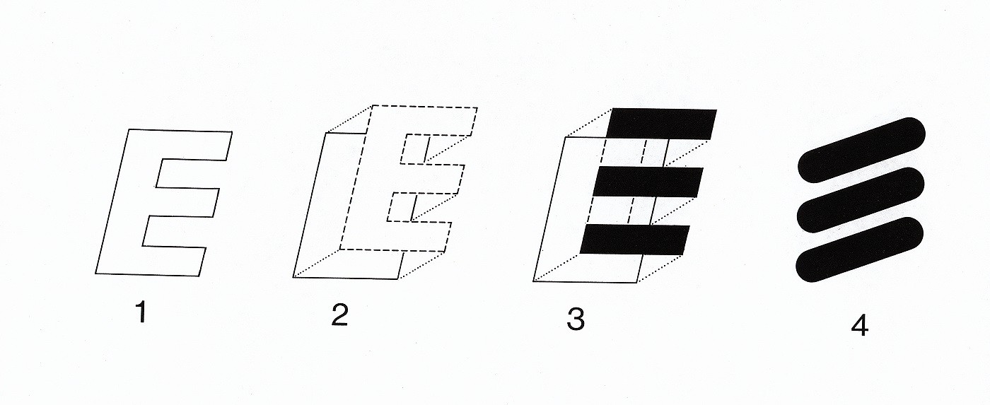
The winning proposal, which was created by Terry Moore, a designer with AID, is best described as a single figure comprising two inseparable elements – the name Ericsson presented in a special typography and a stylized E.
When the question of a company color was addressed, however, the project group was unable to reach an agreement. As a result, the President decided blue would be the uniform corporate color.
Immediately after “The Visual Link” was announced, widespread speculation over the symbolic meaning of the three bars gained momentum throughout the company. There were demands for a more clearly defined, rational explanation than its presentation as a symbol of the stylized E. To satisfy the rational thinkers in the company, therefore, AID prepared several variations of the stylized E.
In the spring of 1981, a large number of ambassadors were appointed – people in corporate staff positions – who would personally visit Ericsson's subsidiaries, associated companies, technical offices, representatives and agents to present and “sell” the CVI-program with the help of “The Ambassador's Kit.” The first CVI-manual was distributed to every Ericsson unit in all parts of the world in the autumn of 1981, complete with guidelines, examples and basic materials.
On January 2, 1982, the new graphic profile was introduced around the world, and “L M” disappeared from Ericsson's corporate name. A completely new company called Ericsson Information Systems set the standard for The Visual Link's formal introduction.
Comments from the market were favorable, as underlined by clever remarks such as “Ericsson's Three Sausages” (Sweden) and “Tres Telebananas” (Mexico) as well other less savory comments not fit to print.
The introduction of the new graphic profile continued for a long period of time, since the company wanted to keep costs down. One key objective was for all consumable supplies, such as advertising materials, printed matter and office material as well as centrally located neon signs and the company's large fleet of cars and trucks, should be changed immediately. Product labels and tools for production, however, could be changed gradually over a longer period of time.
The CVI-manual was eventually supplemented with new instructions as the need arose. No changes, however, were ever made in the two fundamental elements – The Visual Link and the company color.
The new graphic profile offered an active means of providing Ericsson with a new striking force to increase market awareness. It also provided the platform for a concept introduced several years later – The One Company Approach.
Author: Gustaf O. Douglas


